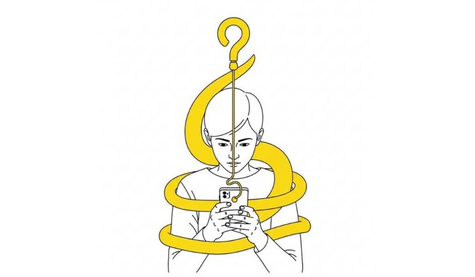
The Ethics of Engagement: A Critical Look at the Patterns We Use to Keep Users Hooked
It’s 10 PM. I know I don’t have the one minute I need to quickly peek into the latest list of notifications from my kid’s school, hoping I haven’t missed anything important. My husband assures me that he has taken a look at them already and that it’s all routine. But I have to check. You know how it is!
I open the app, more to check if he’s right (again?), than anything else.
I blink, and it’s 10:45.
Forty-five minutes of my night, my sleep, and my life have vanished into a hypnotic vortex of scrolling, swiping, and tapping. For forty-five minutes, I was magically guided by an invisible and mesmerizing hand that hypnotized me with one more video, one more photo, one more update. Just one more.
As a user, the feeling is a familiar cocktail of mild entertainment and high-grade regret.
As a designer, my feelings are more complicated. Because I have to admit that, on some level, I knew I helped build this.
Waking Up to the Monster We Helped Create
For the last decade, “engagement” has been the undisputed god-metric of the digital world. We track it, we optimize for it, and we are rewarded for increasing it. A highly engaging product is considered a successful one.
But as our tools for capturing and holding attention have grown more sophisticated, our community has a professional and moral obligation to stop and ask a difficult question: Where does good UX end and unethical manipulation begin?
There is a fine, often blurry, line between creating a product that is compelling and creating one that is coercive. And as the architects of these experiences, we are the ones who draw that line, whether we do so consciously or not.
The Anatomy of a "Hook"
To understand how we got here, we need to be honest about the mechanics we employ. Many of the most common engagement patterns are built on a powerful psychological framework, famously detailed in Nir Eyal’s book Hooked, a quick read that makes you rethink every app we use.
The model consists of four steps:
The Trigger: A notification pops up on your screen. You feel a pang of boredom or loneliness.
The Action: You open the app—a simple, almost unconscious action.
The Variable Reward: This is the masterstroke, a mechanism borrowed directly from the design of slot machines. You scroll the feed, and you never know what you’ll get. It could be a stunning photo, a hilarious video, a message from a friend, or… nothing interesting at all. This unpredictability floods our brains with dopamine, the anticipation chemical, making us scroll again and again, chasing the next potential reward.
The Investment: You like a post, leave a comment, or follow a new account. You are investing your time and data into the platform, which loads the next trigger (e.g., someone responding to your comment) and keeps the loop spinning.
Patterns like infinite scroll, autoplay videos, social proof notifications (“20 people liked your photo”), and gamified “streaks” are all deliberate design choices engineered to exploit these psychological hooks. They eliminate natural stopping points and leverage our deep-seated needs for social validation and our fear of missing out (FOMO).
The Litmus Test: Compelling vs. Coercive
So, when do these patterns cross the line? The most useful distinction I’ve found is to analyze whose intent is being served.
Good UX is compelling: It helps the user achieve their own goals with less effort and more satisfaction. The user is in control. A well-designed e-commerce site that remembers your shipping address to make checkout faster is serving your intent.
Manipulative design is coercive: It leverages psychological biases to make the user do something that primarily serves the platform’s goals (more time on site, more ad revenue), often against the user’s own better judgment. The platform is in control. A travel site that shows “Only 2 seats left at this price!” to create false scarcity and pressure you into a hasty decision is serving its own intent.
When we design a system that a user finds difficult to leave even when they want to, we are no longer serving them.
Real-World Consequences
This isn’t just a philosophical debate. The maximization of engagement at all costs has tangible, negative consequences.
Research from institutions worldwide has linked excessive use of these platforms to a rise in anxiety, depression, and poor body image, particularly among younger users. The constant social comparison and the curated perfection of online life can be corrosive to mental well-being.
A study by Rosen, Whaling, Rab, Carrier, and Cheever revealed how online multitasking was linked to mental health issues. Similarly, Primack and Escobar-Viera discovered that having multiple social media accounts increases anxiety, as the constant demands can feel overwhelming.
In a population-level analysis of Korean school students, Harris Hyun-soo Kim studies the impact of online social networking on adolescent psychological well-being, discussing how “media affect youth by shaping what they do and believe through adaptation and imitation.”
Beyond mental health, there is the erosion of focus. Our brains, rewired for constant, bite-sized dopamine hits, are finding it harder to engage in deep, focused work.
A 2019 study from the Technical University of Denmark noted a global trend of narrowing collective attention spans, driven by the sheer volume of information and the speed of its consumption online.
Furthermore, algorithms designed purely for engagement have been shown to amplify misinformation and outrage, because polarizing content often generates the most potent emotional reaction—and thus, the most clicks, comments, and shares.
A Path Forward: Designing for Mindful Engagement
As designers, we can choose to build a different future. This doesn’t mean creating boring, unengaging products. It means shifting our goal from capturing maximum attention to earning earned trust.
Create Finite Experiences: The most respectful phrase in modern UX might just be, “You’re all caught up.” Replace infinite scrolls with clear, satisfying end points. Give people a natural place to pause and decide if they want to continue.
Design for User Control: Put users back in the driver’s seat. Make notifications easy to customize and turn off. Let users choose a chronological feed over an algorithmic one. Make autoplay an opt-in feature, not a default.
Introduce “Friction for Good”: Sometimes, the most ethical design choice is to add a moment of friction. A simple dialogue box that asks, “Are you sure you want to post that?” before a heated comment, or a screen that gently suggests, “Time for a break?” after a long period of use, can empower users to be more intentional.
Align Business Goals with Well-being: We must make the case in our organizations that long-term user trust is more valuable than short-term engagement metrics. A product that burns out its users will eventually be abandoned. A product that respects its users’ time and well-being builds a loyal, sustainable community.
The Ethical Designer’s Oath
As designers, our work has the potential to influence and shape the lives of billions. This means that we carry immense responsibility. While chasing engagement isn’t inherently wrong, doing so without a conscience can cause harm we could never control or correct.
Let’s prioritize humane connections over metrics. Let’s aim to empower users and do our bit against design demands that promote the use of manipulative realities.
I know I want to be able to access the stuff that matters without design tricks constantly vying to pull me away.
You do too. And so do your users.


